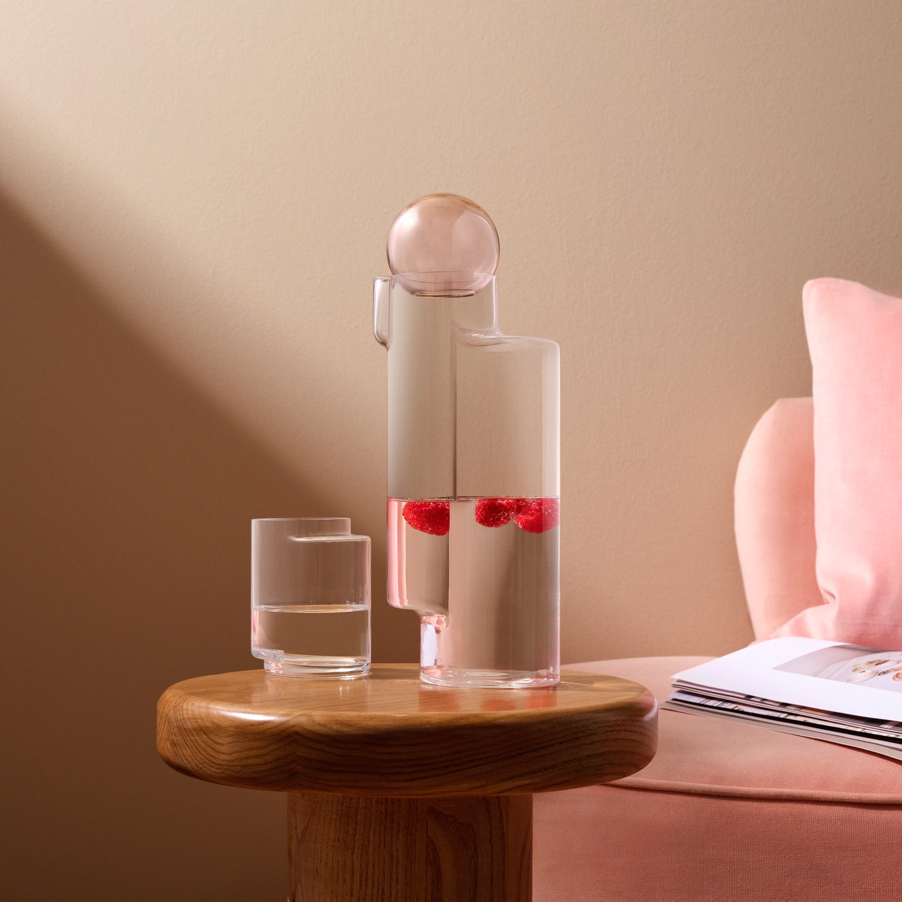
"Not too little, not too much... just right"...
This month we invited London-based writer and designer, Cate St Hill, to explore the idea of “Lagom” - a Swedish phrase translating roughly to "not too little, not too much... just right". Lagom speaks to interiors, how balance and moderation can lead to visual and mental appeal, but also to a wider approach to lifestyle and contentedness.
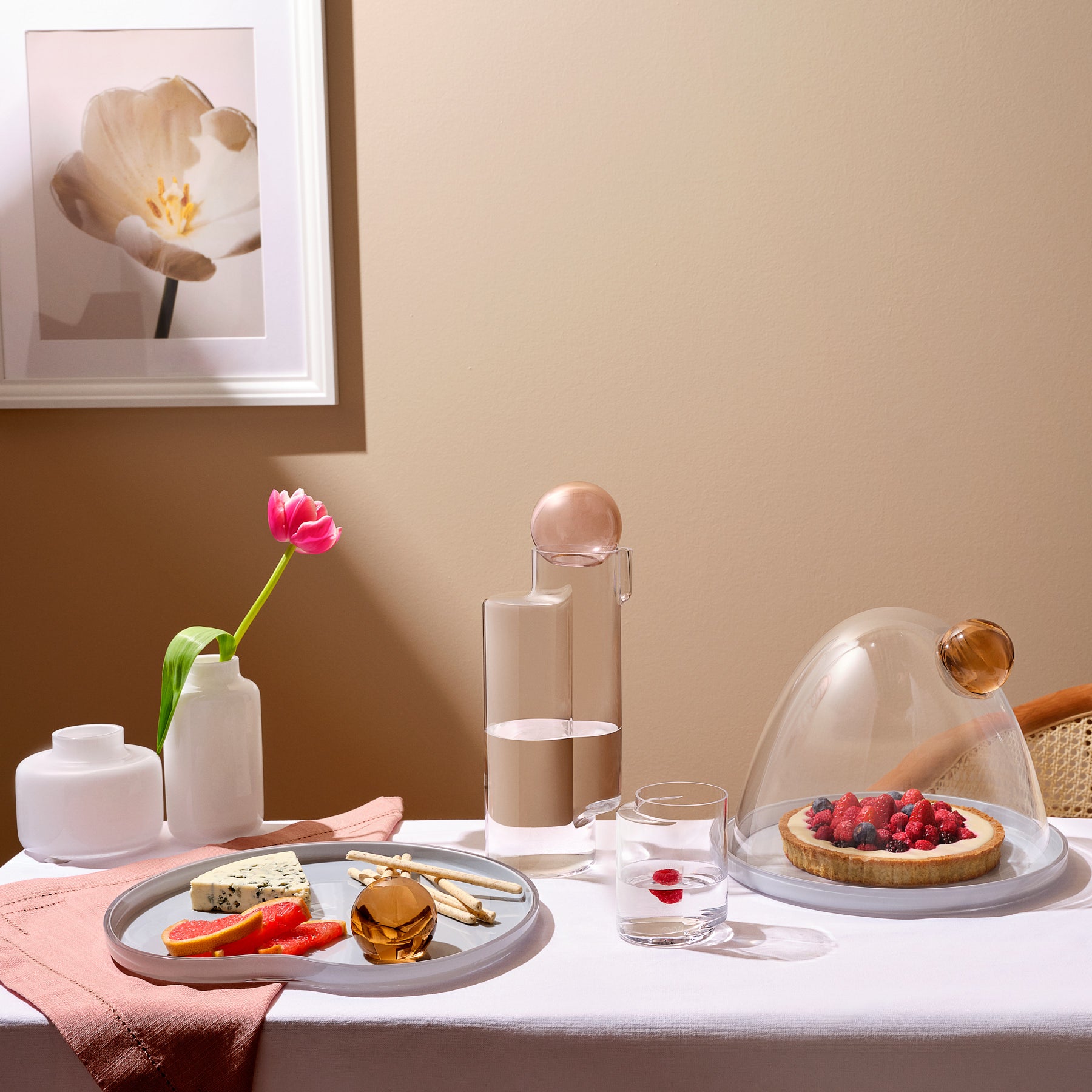
Cate, known for her pared-back interior style and a design philosophy rooted in simplicity, sustainability, and lasting design, invited us into her space to show how she curated several of our collections aligned with a Lagom-inspired approach, and her take on #simpleisbeautiful

We sat down for a conversation with Cate to gather some of her thoughts on Lagom, her creative process, and where she finds inspiration…
How does the concept of Lagom resonate with you?
I think we could all do with a bit more balance in our busy lives. I like the idea of taking inspiration from the Swedish way of living and finding time to slow down and appreciate the little things in life. For me, the concept of ‘not too much, not too little’, means taking a mindful approach to decorating my home and paring things back in a simple way. I want everything in my home to bring me joy and connect with me, so I’m selective with the objects I have around me. They need to be functional and beautiful. Lagom allows us to enjoy things in moderation - it’s also about not taking too many resources from the planet. It’s a reminder that we can be content with less.
Your three guiding principles with Lagom?
- Declutter your home and consider what you really need - objects stand out and take on more meaning when there’s less visual clutter around them
- Use sustainably-sourced, natural materials that are less harmful to the planet
- Just because Lagom might favour a more minimal approach, it doesn’t mean a space needs to lack character or cosiness - add (just the right amount) of candlelight and fresh greenery into the home to bring it to life

Your creative process?
When I’m designing a space I like to think about the material palette first – I’ll hone in on the textures before getting to the finer details later. I think it’s really important to create a space that appeals to all the senses - so as well as the overall picture, I’ll think about touch and tactility (everything from how a sofa feels to curl up on to the light switches you flick on when first entering the room). I always like to create a mood board first – it helps set a cohesive framework for a project and stops a scheme becoming too confused later down the line. I’ll also think of three or four key words to describe a space. Then when I’m sourcing objects or worrying if this goes with that, I just have to go back to my key words and make sure it ticks those boxes.
“For me, the concept of ‘not too much, not too little’, means taking a mindful approach to decorating my home and paring things back in a simple way. I want everything in my home to bring me joy and connect with me…” - Cate St Hill
Your main source of inspiration?
I think travel. I take a lot of inspiration from the places I visit, it might be the tiles in a restaurant bathroom, a piece of furniture in a hotel lobby or the colour of an old door. Stepping out of the ordinary always helps fire up creativity.
Favourite collection?
I love the Mist vases; the lines are so appealing and help give the glass texture and intrigue.
I love how the lines play with pattern when a flower or stem is introduced, creating a unique display every time you create an arrangement. Ribbed glass is everywhere at the moment, but with NUDE Glass you can be assured you're buying a quality product that will stand the test of time, beyond fleeting trends. I also love NUDE's lighting collection, the Smooth and Orion lamps are particularly beautiful and have such a lovely tactility to them, pairing stone with glass.


